Design resources
Be more efficient designing and developing with the same library.
Design kits
Material UI component designs are available for Figma, Sketch, and Adobe XD, providing accurate representations using shared terminology for all states, variants, and permutations of each component.
The design kits are composed of over 1,500 unique elements built to speed up the development process and ease communication for teams of designers and developers using the library.
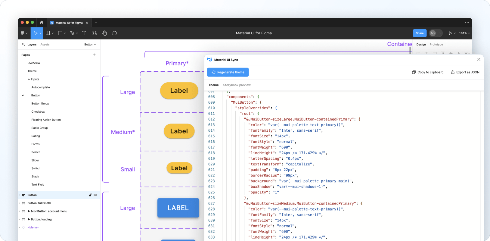
Material UI Sync Figma plugin
Sync is a Figma plugin to help bridge the gap between designers and developers using Material UI.
It generates a theme file that you can add to your codebase with all the design tokens and component customizations from Figma. You can quickly preview all of the changes through an embedded Storybook panel directly in the plugin interface.
Sync is currently in beta and available for free in the Figma Community. You can also head over to the Sync documentation page to learn more.

Third-party resources
UXPin
Material UI for UXPin: A large UI kit of Material UI components. The design tool renders the components in a web runtime. It uses the same React implementation as your production environment.