Card
Cards contain content and actions about a single subject.
Introduction
Cards are surfaces that display content and actions on a single topic. The Material UI Card component includes several complementary utility components to handle various use cases:
- Card: a surface-level container for grouping related components.
- Card Content: the wrapper for the Card content.
- Card Header: an optional wrapper for the Card header.
- Card Media: an optional container for displaying background images and gradient layers behind the Card Content.
- Card Actions: an optional wrapper that groups a set of buttons.
- Card Action Area: an optional wrapper that allows users to interact with the specified area of the Card.
Word of the Day
adjective
well meaning and kindly.
"a benevolent smile"
Basics
import Card from '@mui/material/Card';
import CardContent from '@mui/material/CardContent';
Outlined Card
Set variant="outlined" to render an outlined card.
Word of the Day
adjective
well meaning and kindly.
"a benevolent smile"
Complex Interaction
On desktop, card content can expand. (Click the downward chevron to view the recipe.)
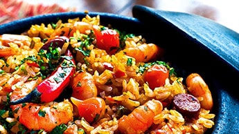
This impressive paella is a perfect party dish and a fun meal to cook together with your guests. Add 1 cup of frozen peas along with the mussels, if you like.
Lizards are a widespread group of squamate reptiles, with over 6,000 species, ranging across all continents except Antarctica
By default, we use the combination of a <div> element and a background image to display the media. It can be problematic in some situations, for example, you might want to display a video or a responsive image. Use the component prop for these use cases:

Lizards are a widespread group of squamate reptiles, with over 6,000 species, ranging across all continents except Antarctica
Primary action
Often a card allow users to interact with the entirety of its surface to trigger its main action, be it an expansion, a link to another screen or some other behavior. The action area of the card can be specified by wrapping its contents in a CardActionArea component.
A card can also offer supplemental actions which should stand detached from the main action area in order to avoid event overlap.
UI Controls
Supplemental actions within the card are explicitly called out using icons, text, and UI controls, typically placed at the bottom of the card.
Here's an example of a media control card.
🎨 If you are looking for inspiration, you can check MUI Treasury's customization examples.