Q3 2020 Update
Olivier Tassinari
@oliviertassinariThis update covers our progress over the last three months, and what we aim to achieve in the coming months.
Product
Here are the most significant improvements since June 2020. This was a dense quarter!
🚧 We have started the quarter with the first pre-release v5.0.0-alpha.1 of the next major iteration of the library. There have been eleven more pre-releases since then. During the alpha development stage of version 5, we are focusing on making the planned breaking changes, as well as developing new features. On the breaking changes side, we have made almost half of the changes that we have planned.
🧪 We have promoted 7 components from the lab to the core: Alert, Autocomplete, Pagination, Rating, Skeleton, SpeedDial, and ToggleButton. Thank you for all your feedback on these components. While we still plan a couple of breaking changes on them, we are confident that they have reached the same level of quality as the other core components.
👮 We have introduced a new component in the lab, the FocusTrap. It manages focus for its descendants. This is useful when implementing overlays such as modal dialogs, which should not allow the focus to escape while open:
⚛️ We have prepared the support for the upcoming release of React v17. Most of the work was about better handling events, and updating our test infrastructure to run the whole test suite with the latest and next version of React.
We have also improvedStrictModesupport. The last standing issues are being addressed with the work on the style engine. More on that later in the post.💅 We have introduced a new dynamic variant API. This API allows developers to add new variants to Material UI components right from the theme, without having to wrap the components. For instance with the Button:
// Define the style that should be applied for specific props. const theme = createMuiTheme({ components: { MuiButton: { variants: [ { props: { variant: 'dashed', color: 'secondary' }, styles: { border: `4px dashed ${red[500]}`, }, }, ], }, }, }); // Optionally retain type safety: declare module '@mui/material/Button' { interface ButtonPropsVariantOverrides { dashed: true; } } // Enjoy! <Button variant="dashed" color="secondary" />;This change is part of a direction to ease the implementation of custom design systems. Note that the API not only allows to match a single prop, but also a combination of props. This is especially interesting to resolve the conflict when different variants try to modify the same CSS property.
Hopefully, in the future, we will be able to take advantage of the variant feature coming in Figma with this API.
⚡️ We have released a first alpha version of the data grid component.
We announced our intent to build this component a year ago. While we could have implemented a simple version and release it a month later, it wouldn't have set us in the right direction for the years to follow. We're aiming aim to deliver the best-in-class React data grid. This objective requires a twin licensing model. The component is available under an MIT license for the features that can be relatively easily implemented, and that can be sustained with an open-source model; as well as a paid commercial license for the more advanced features.
To ensure we could meet this objective, we spent time finding an expert in the field. This led us to open a new job position, and, a few months later, Damien Tassone joined to lead the work on this component.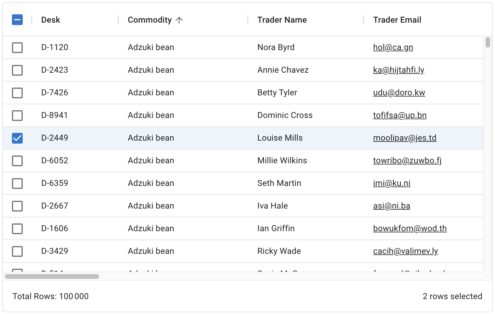
100,000 rows
After 6 months of development since the initial commit (March 15th, 2020), you can start using the component! (It targets v4.)
⚡️ The data grid effort has led to the introduction of a new repository: mui/mui-x. This is the repository that will host all the future commercial components, all the components that we can't sustain with the open-source model. MUI X is our next iteration in scaling MUI, both as a company and as a comprehensive React library of components. While we have an existing sustainability model that can support, in long term, up to 10 people full-time, we are keen to push it by an order of magnitude.
🛠 We have migrated parts of the codebase to TypeScript.
We had to work on the code infrastructure of mui/material-ui to prepare to host the date picker components that are written in TypeScript inside the lab (coming from mui/material-ui-pickers that we will archive once we can).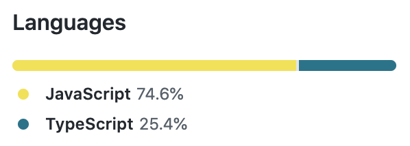
MUI's repository
On the other hand, we started using TypeScript from day one for mui/mui-x.
MUI X's repository
🐙 We have migrated large parts of the test suite to react-testing-library.
15 months ago, we introduced the very first test using the library (to replace enzyme). Last month, react-testing-library had more downloads than enzyme!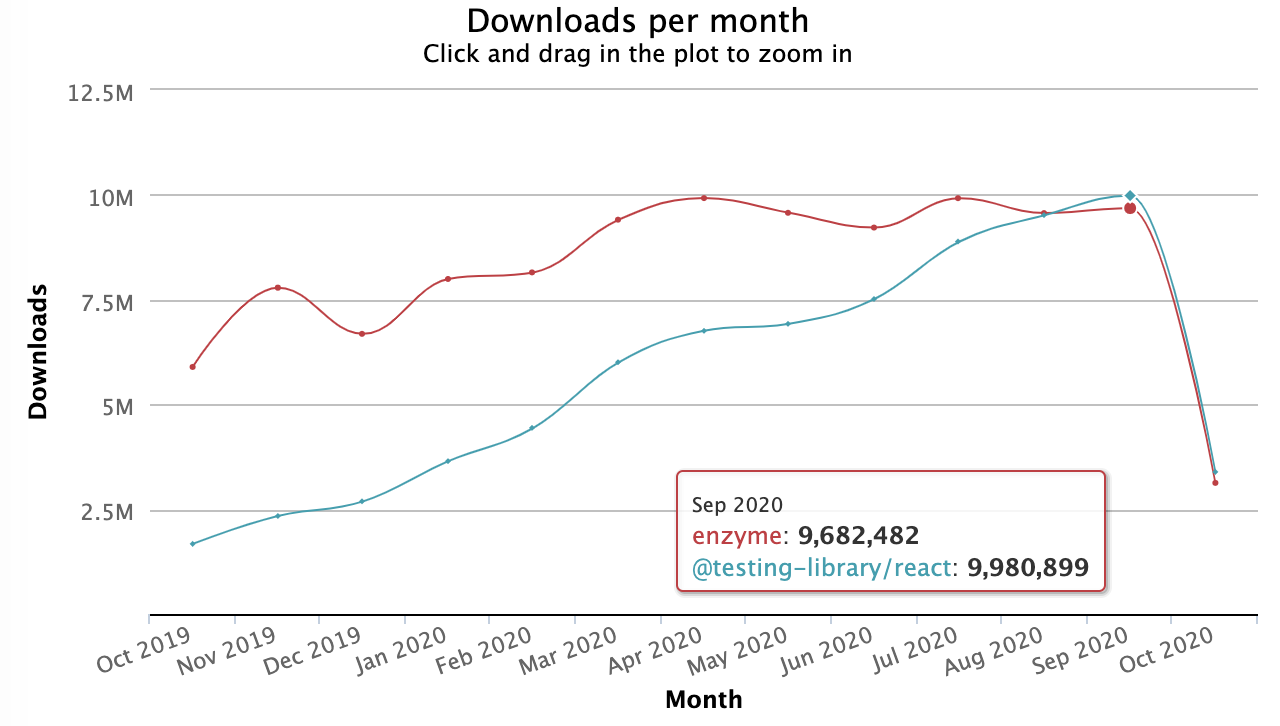
💅 We have completed the first iteration of the unstyled components for v5.
You can find a new version of the slider in the lab without any styles. The unstyled component weighs in at 5.2 kB gzipped, compared with 26 kB for the styled version (when used standalone). The component is best suited for use when you want to fully customize the look, without reimplementing the JavaScript and accessibility logic.
We're also pushing in this direction to address a concern we hear from large enterprises that want to be able to go one layer down in the abstraction, in order to gain more control.import SliderUnstyled from '@mui/lab/SliderUnstyled';Note that we have experimented with headless components (hooks only) in the past. For instance, you can leverage the useAutocomplete, and usePagination hooks. However, we are pushing with unstyled first as a required step for the next item: ⬇️.
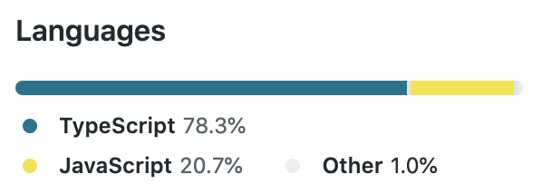
👩🎨 We have completed the first iteration of the new styling solution of v5.
You can find a new version of the slider in the lab powered by Emotion.
If you are already using styled-components in your application, you can swap Emotion for styled-components 💅. Check this CodeSandbox or CRA for a demo. It relies on aliases to prevent any bundle size overhead.
The new styling solution saves 2kB+ gzipped in the bundle compared to JSS, and about 14 kB gzipped if you were already using styled-components or Emotion.
Last but not least, this change allows us to take advantage of dynamic style props. We will use them for dynamic color props, variant props, and new style props available in the core components.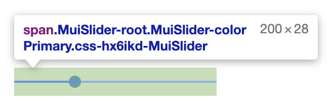
Slider powered by Emotion
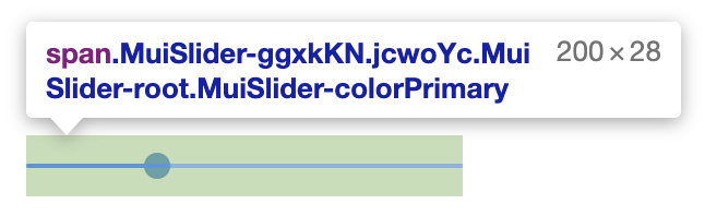
Slider powered by styled-components
♿︎ We have kept investing in accessibility, we have fixed 13 bugs.
🗓 We have introduced public quarterly roadmaps, both for each MUI Core product and MUI X.
Company
We are thrilled to welcome two new full-time developers to MUI:
Marija Najdova. Marija joins us from the Fluent-UI React team at Microsoft. She's allowing the community team to move faster. You can learn more about her in the introduction blog post.
Danail Hadjiatanasov. Danail comes to us from the Fintech industry. He's allowing the enterprise team to move faster, he's helping Damien push the data grid further.


Growth between Q2 2020 and Q3 2020
📦 From 5.1M to 6.0M downloads per month on npm.
While React is growing, we are also growing inside its ecosystem.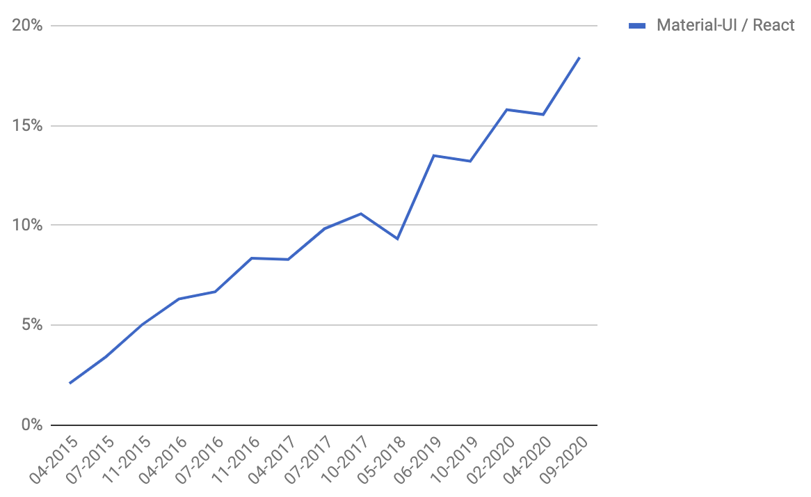
% of download relative to react-dom
⭐️ From 59.0k to 61.6k stars, leave us yours 🌟.
👨👩👧👦 From 1,825 to 1,934 contributors on GitHub. We add on average 1 new contributor every day.
🏢 We have welcomed two new full-time developers to MUI.
Our roadmap intent for Q4 2020
We'll do our best, no guarantee!
Community
- 🗓 Execute on all the items of the public roadmap.
- 👩🎨 Simplify the migration experience from v4 to v5.
- ❓ Please upvote GitHub issues if you want us to focus on a specific problem. The number of 👍 helps us to prioritize.
Enterprise
- 👩🎨 Complete the collaboration we started with a design agency last quarter to update the branding of the company, redesign the homepage, and design the marketing pages for the enterprise package.
- 🗓 Execute on all the items in the public roadmap.
- ❓ Please upvote GitHub issues if you want us to focus on a specific problem. The number of 👍 helps us to prioritize.
Company
These are objectives, no guarantees:
- 🏢 We might hire a full-time designer that has coding skills. One of the objectives would be to solve #22485.
- 🏝 We have put the company-wide team retreat on hold because of the continued risk presented by COVID-19. Hopefully, we will be able to hold it in Q2 2021.